
Project Brief:
This project covered one of my favorite things in life, music. Mayhem festival is an annual tour that travels across the United States while showcasing a long list of heavy-hitting names in the metal music industry. The goal of this solution was to bring back the metal scene and create a connection between contemporary bands and artists, and traditional heavy hitting all-stars. To create connections between old and new, I created a solution to modernize the edgy high school vibe into a universal language that more fans can enjoy.
The Idea:
Since I really enjoy listening to music, I wanted to take a shot at rebranding a festival I have attended in the past. I chose Mayhem Festival which was previously sponsored by Rockstar Energy Drink. The original aesthetic was really dated and blatantly expected in terms of the targeted demographic so I saw this as an opportunity for further development. The Metal Mulisha is a group of MX stunt riders who also tour with the festival and I knew this would be a big push in terms of the new branding for this festival. Rather than rely on Rockstar Energy and the expected visuals associated with heavy metal, I want to create a more approachable and inclusive theme across this new brand. This is how I landed on my rebrand now known as MAYHEM.
Process:
This was a fun project because I was able to work with visuals I thought would compliment a new and emerging crowd of younger fans of the genre while still appealing to the older fans who grew up on this kind of music. I started my rebrand with creating new brand standards which consisted of a new color scheme, typeface selections, and branding elements. Next came revising the logo and this was the first step in redefining the standards that this festival previously lived by. I created a more modern approach to the logo where I could be able to scale it appropriately while maintaining legibility and identity. Once I had a logo, it was time to create a poster that captured the essence of the new brand. I needed to find a way to represent the new identity that consisted of a more adrenaline and motocross fueled style rather than the grunge skull and crossbones that the original brand was painted with. From here I created a brochure advertising the highlights of the poster and also including a map of the area that the new festival would be taking place at. The final pieces of this new puzzle would be creating a small social media series and a commercial for MAYHEM.
Solution:
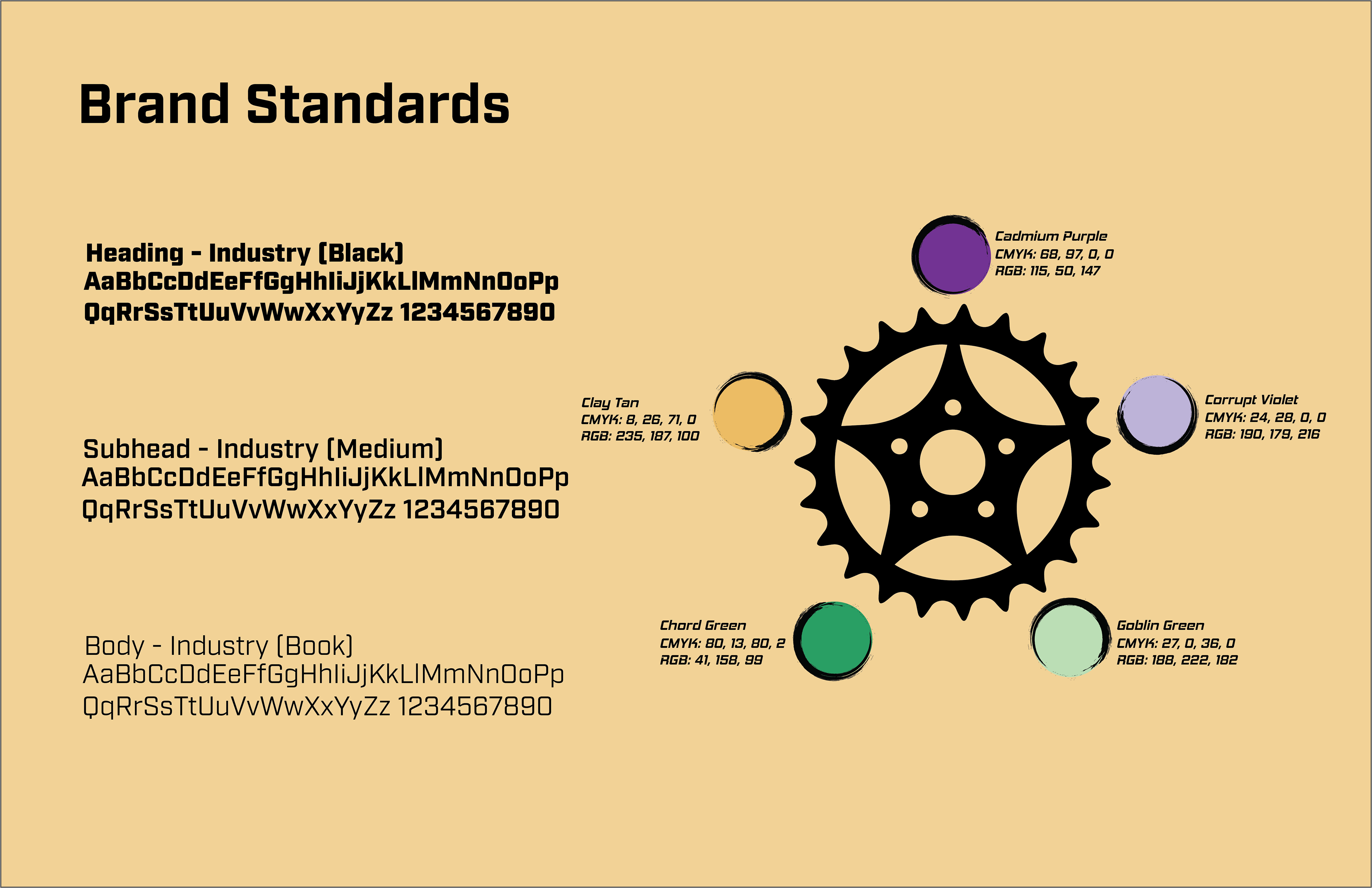
MAYHEM brand standards
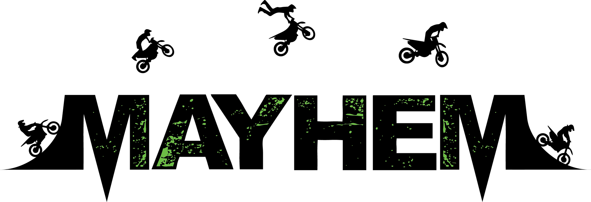
MAYHEM new logo

MAYHEM alt logo for smaller application
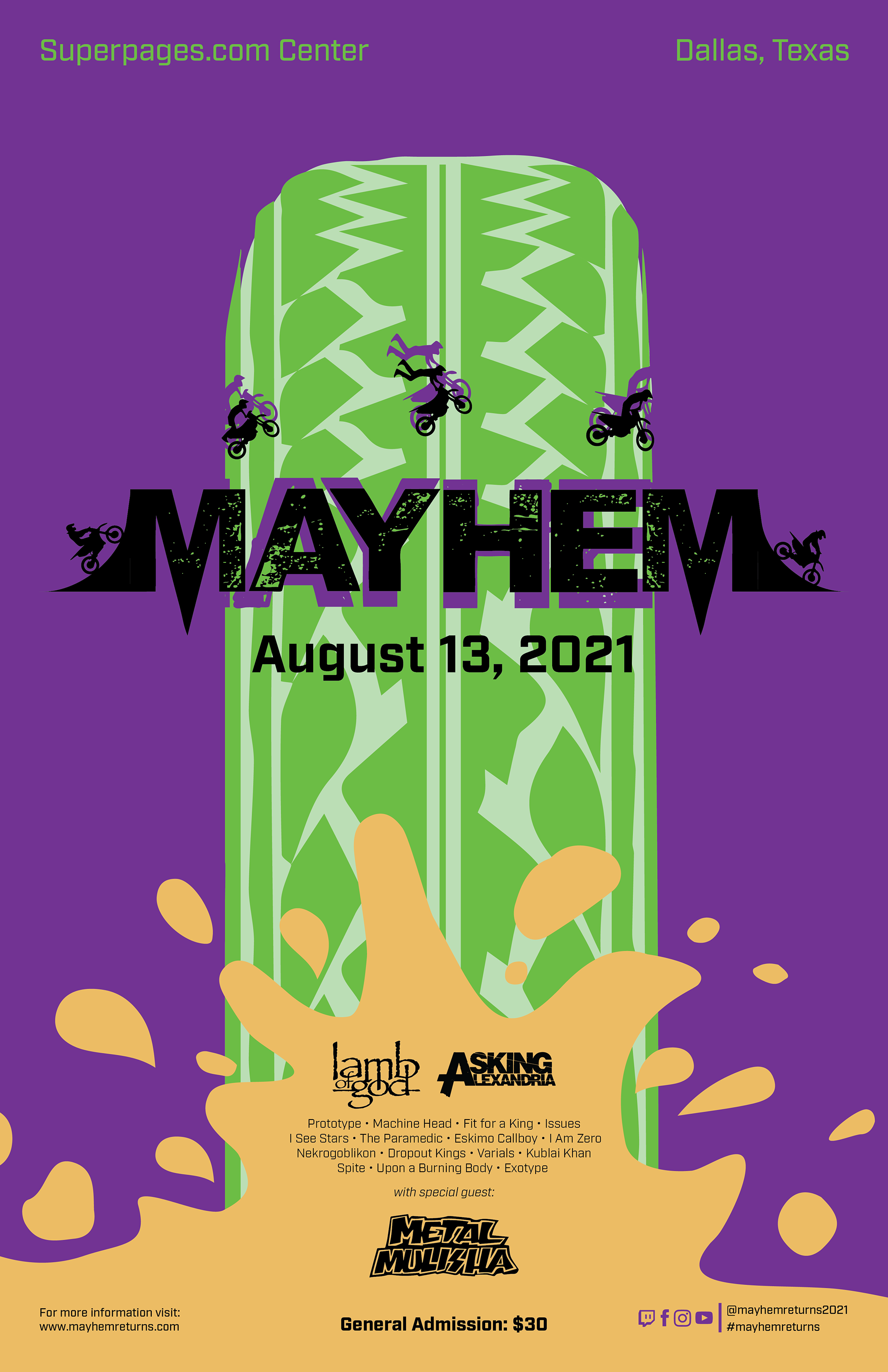
MAYHEM promo poster
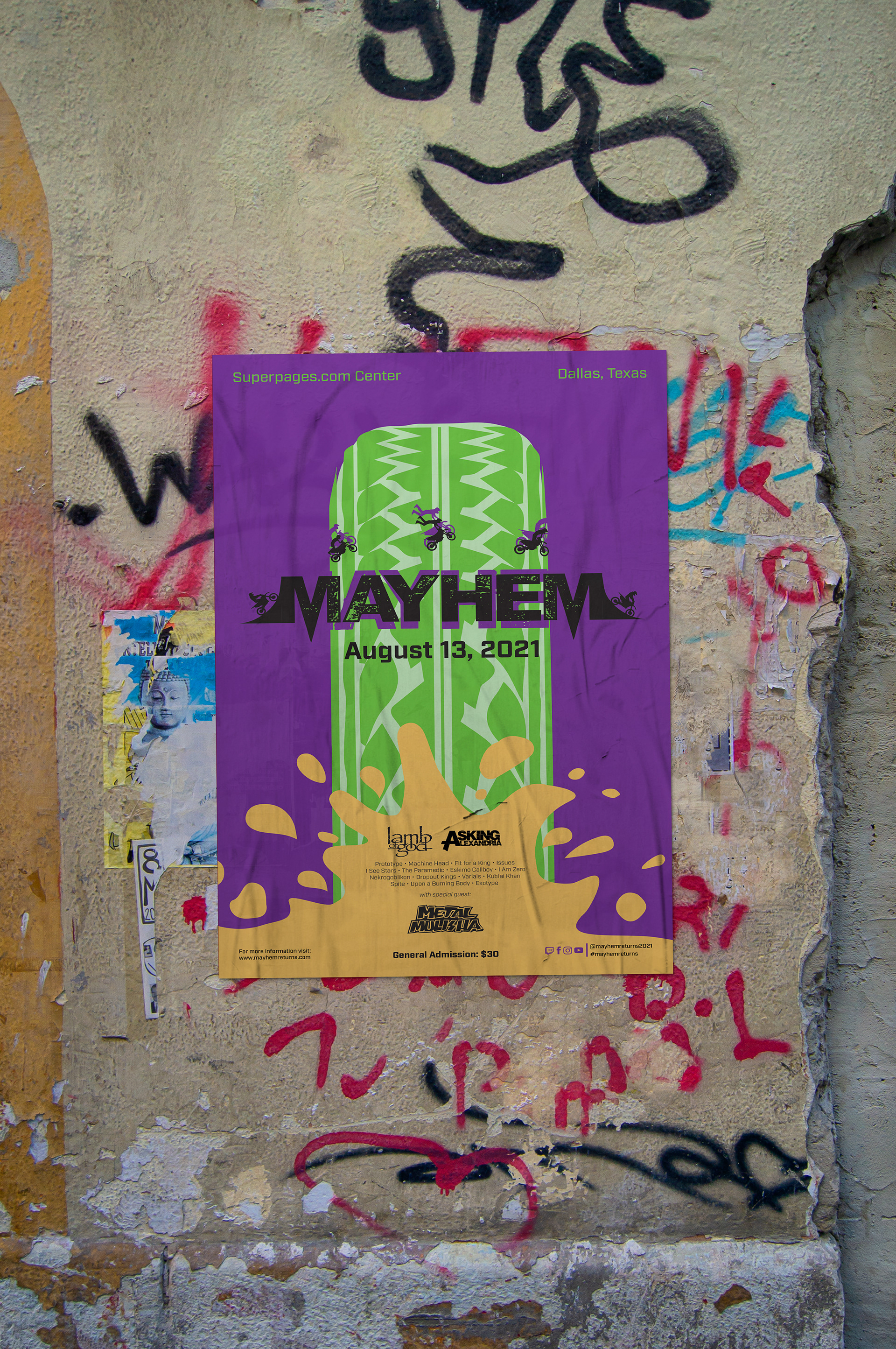
MAYHEM poster mockup

MAYHEM promotional brochure mockup
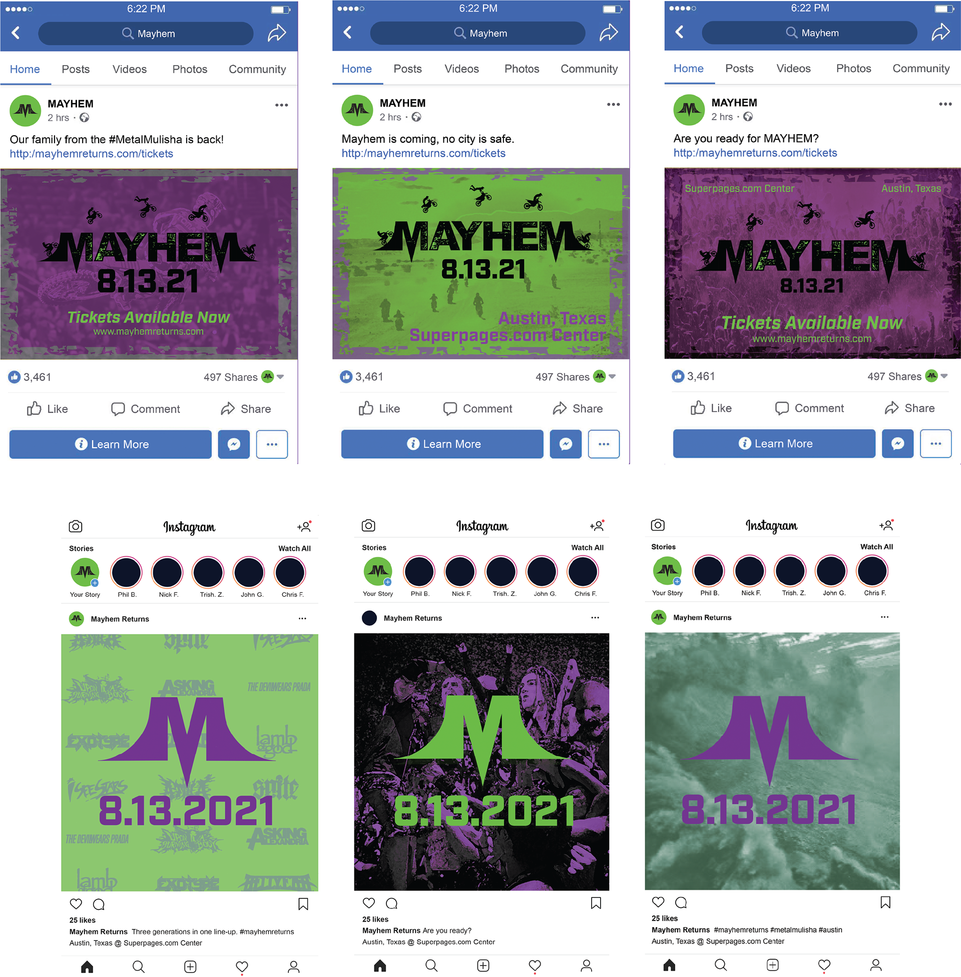
MAYHEM social media advertising
MAYHEM Instagram TV advertisement