
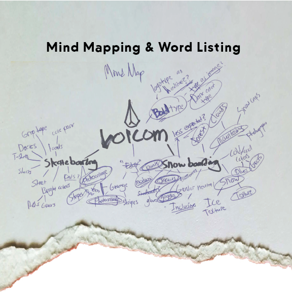
Word listing helped me settle on a direction for the product catalog. I chose to approach it from a winter-themed angle rather than the expected skateboarding route.
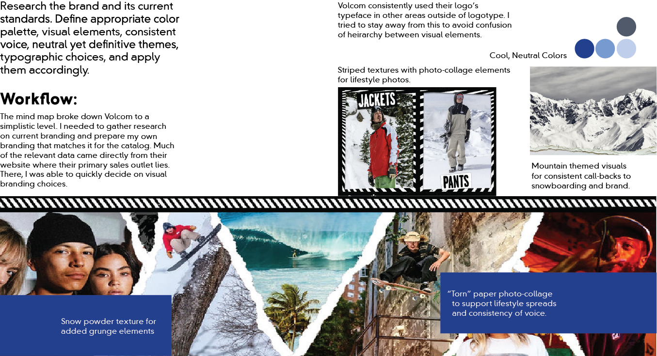
This was a collection of my visual research for Volcom as a brand. I needed to take note of the key defining elements in their branding and prepare to apply them to my product catalog.
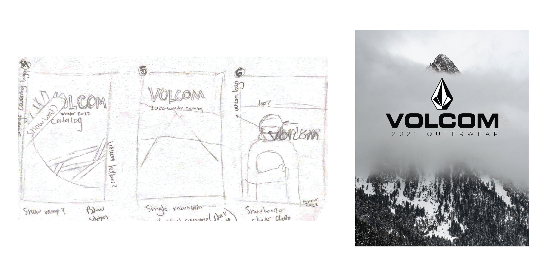
I wanted the cover to follow Volcom’s visual standard when it came to catalogs while also tying back to the products themselves. Since it was a winter outerwear catalog, it felt appropriate to use mountain themed photography with emphasis on the snow visuals.
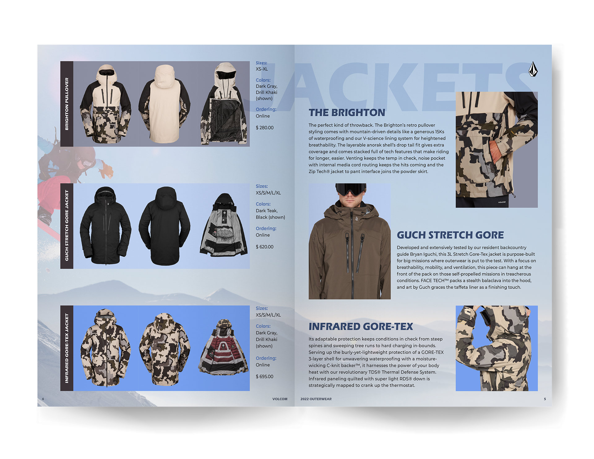
This is an example of my product showcase grids where I wanted to present the product in a quickly digestible view.
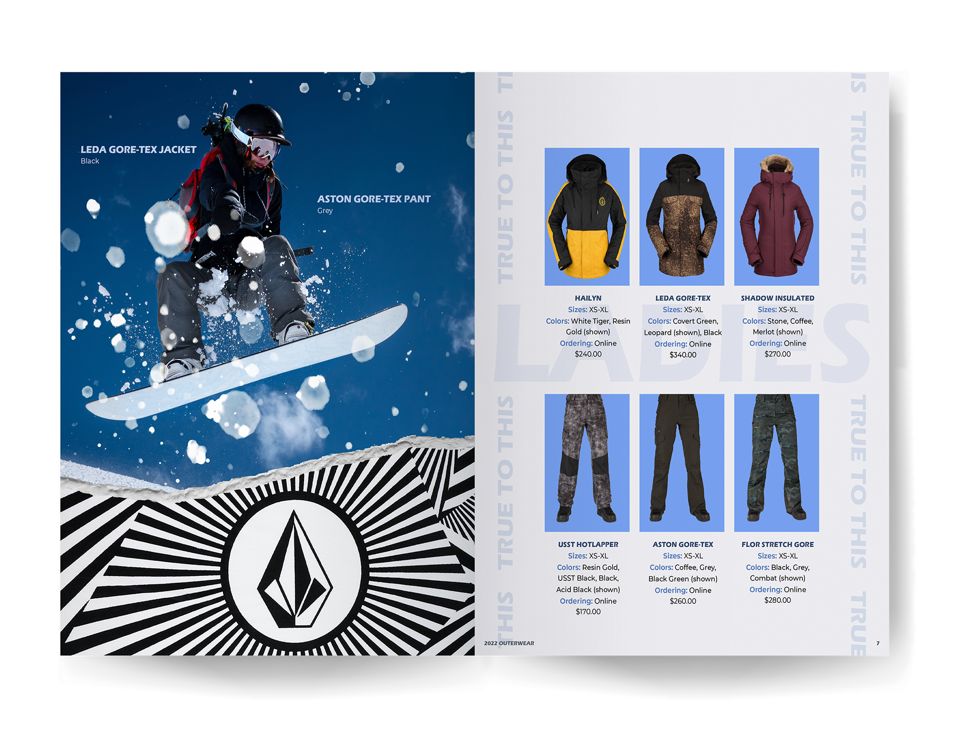
Since I also wanted the branding for this catalog to feel inclusive, I kept the colors soft and neutral. This created opportunity to incorporate a women's product spread.
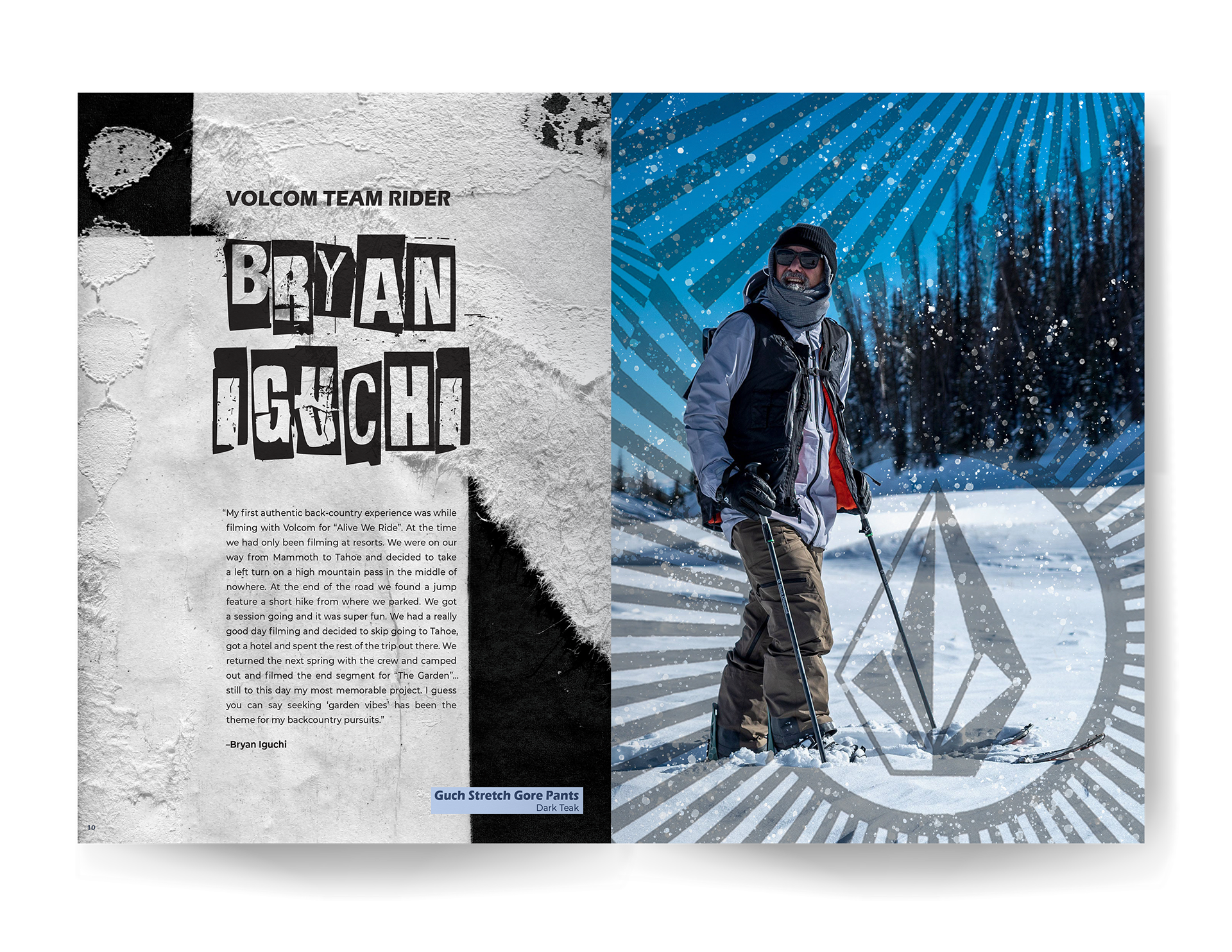
The torn paper style created a strong grunge feel while staying true to Volcom's branding. This is one of the examples of the photo manipulating I was able to do between found brand elements and brand photography.
